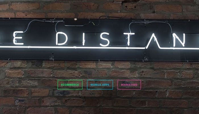
One of the web design trends that survived the transition from 2014 to 2015 is the rise of ghost buttons. Ghost buttons (also known as ‘empty’ or ‘hollow’ buttons) are transparent buttons bordered by a very thin line and text inside them is usually printed in light sans-serif font. Ghost buttons also tend to be bigger than standard buttons and immediately capture the users eye due to their phantom-like quality.
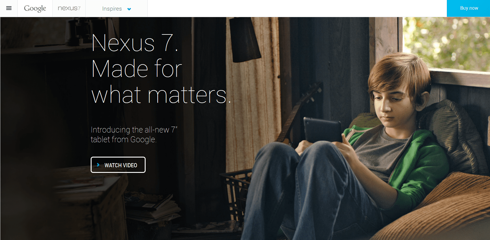
The term itself was first coined by a Tumblr blog called Websites with Ghost Buttons in early 2014, although the seeds of the idea might be also be found in HUD Displays, Apple iOS 7 user interface with its set of minimal buttons and icons, Google Nexus 7 website, and Twitter Bootstrap whose homepage includes a prototype of a ghost button.
Ghost buttons are easy to create with standard graphic design software such as Photoshop or Illustrator and they can provide elegant look to a website. Its also easy to integrate them with other design elements as they don’t take too much space. Much like with any other trend, however, one should not get addicted to it – while ghost buttons can add elegance to a site, they are not a magic solution to every design problem. If the button isn’t placed wisely then it would be hard to spot it, plus its heavy use of transparency may lead to legibility problems. Wrong photographic backgrounds and bad color schemes used in combination with transparent buttons may also lead to bad results.
Ghost buttons can be very impressive when implemented correctly – just make sure to pay as much attention to elements surrounding them (such as large-scale photographic backgrounds) as to buttons themselves!
Ghost Button Gallery